PinnedTaras BakusevychinUX Collective58 rules for beautiful UI designThe right UI can elevate an application from functional to unforgettable, making the difference between a user who engages once and one…Jan 945Jan 945
Taras BakusevychinUX CollectiveLoading & progress indicators — UI Components seriesEngage users and enhance waiting experiences with these simple recommendations.Jul 11, 202314Jul 11, 202314
Taras BakusevychinUX CollectiveUser onboarding: best practicesSimple rules that will help you design a streamlined first-time users experienceJan 12, 202312Jan 12, 202312
Taras BakusevychinUX Collective10 design principles every designer should knowDesign Principles are an assortment of considerations that form the foundation of any good product design. Hundreds of widely applicable…Jan 18, 20227Jan 18, 20227
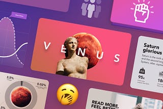
Taras BakusevychinUX Collective20 ideas for better data visualizationApplications we design are becoming increasingly data-driven. The need for quality data visualization is high as ever. Confusing and…Aug 19, 202140Aug 19, 202140
Taras BakusevychinUX CollectiveTop vs side navigation: Which one is better for your product?Today we compare them to see who will pack more punches.Mar 2, 202110Mar 2, 202110
Taras BakusevychinUX CollectiveDesign thinking workshop — step by step guideLearn how to plan and run a successful design thinking workshop. Helping teams reach important objectives and have fun.Feb 9, 20211Feb 9, 20211
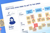
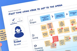
Taras BakusevychinUX CollectiveThe ultimate guide to customer journey mappingJourney mapping may seem complex, especially if you trying to do it in the group workshop. This article will give you a powerful tool and…Sep 22, 202011Sep 22, 202011
Taras BakusevychinUX Collective20 tips for better presentation designImprove your presentation and wow your audience.Aug 4, 202010Aug 4, 202010
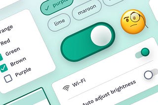
Taras BakusevychinUX CollectiveSelection controls — UI component seriesMaking choices never was more satisfying. A detailed look at checkboxes, radio buttons, and toggles design.Jun 24, 202029Jun 24, 202029